

|
S82 mPT #3: Branded for Success?
Due: Sunday, May 11th @ 11:59 PM PST
|
 RLG91
RLG91Registered Member
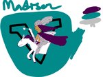
Not gonna sleep on 7 and his branding, but so far, the Madison Valkyries branding has looked incredible. I am here all day for that Imperial Jade. Definitely Mighty Ducks vibes.
![[Image: iAwyGby.jpeg]](https://i.imgur.com/iAwyGby.jpeg) Jexter
JexterIIHF Head Office Fantasy Flame Out
Of the current ones that are revealed, I really like Madison, but that is just me as a Wisconsin homer. Nashville is nice too, but I do love the combo of Norse mythology and the color scheme of Madison’s as well
![[Image: F84OPdM.jpeg]](https://i.imgur.com/F84OPdM.jpeg) Shoutout TheOPSquid for the Sig
]
Struck Gold Award
spideyRegistered S8, S9 Challenge Cup Champion
I think I will give the edge to Nashville. I love the Americian Traditional tattoo style logo and colour scheme and feel Nashville is an amazing market for the SHL.
![[Image: Ak8rQKy.png?width=675&height=375]](https://media.discordapp.net/attachments/1086360707303489571/1097935215311200416/Ak8rQKy.png?width=675&height=375) Sig by Lazyeye
![[Image: image.png?width=600&height=300]](https://media.discordapp.net/attachments/1086360707303489571/1109630983558402178/image.png?width=600&height=300) Sig by DaBoot
   MuNk22
Registered Posting Freak
My favorite SHL expansion team branding is Madison. I'm from Wisconsin and took part in the creative discussions so now its kind of personal for me.
![[Image: i0jCvwr2_o.png]](https://images2.imgbox.com/83/b3/i0jCvwr2_o.png) Raf_TML
Raf_TMLSimmer Simmer
mpt pass
![[Image: Raf_TML.gif]](https://sig.grumpybumpers.com/host/Raf_TML.gif) Thanks GabeyD, Moosey, and Vice for the sigs!
Florence Amélie Mackenzie | Vancouver Whalers | Player Page
![[Image: VGl3CB4.png]](https://i.imgur.com/VGl3CB4.png) Soviet Sexpot
Soviet SexpotMedia Graders Senior Member
I hate to sound like everyone else, but the SHL has a long storied history of good branding and efforts in that department. My vote too is for Nashville, given my affinity for the team and the city as a whole.
![[Image: yxRlGdj.png]](https://i.imgur.com/yxRlGdj.png) dude_man
dude_manSMJHL GM Senior Member
Honestly all the brandings are great in their own way, but the one I love above them all is the Nashville Sound. Obviously Tennessee is just overall a great place for a team and the colors are honestly so killer. But overall just a great list of expansions for the teams
TateRegistered Posting Freak
My definite fav for now is the Madison Valkyries as the new logo update is so good and makes me want to get a jersey! Like damn, good job
![[Image: lqfXIpe.jpeg]](https://i.imgur.com/lqfXIpe.jpeg) ![[Image: FThunMn.png]](https://i.imgur.com/FThunMn.png) ValorX77
ValorX77Registered Posting Freak
My personal favorite of the team branding is Nashville, there’s something very special about those colors, although it does feel familiar to the PBE Nashville team, but who cares I like it.
![[Image: Mumei-NOLA-Sig.png]](https://i.postimg.cc/DyLGWbBF/Mumei-NOLA-Sig.png) ![[Image: FThunMn.png]](https://imgur.com/FThunMn.png) MN_Moosey
MN_MooseyRegistered Senior Member
Nashville Sounds are a minor league baseball team so the expansion give me the ick. Denver has a cool color scheme so I'll go with that tho the name is not my favorite.
a_canuckRegistered Senior Member
They all look pretty darn good so far! If I had to pick one it would probably be the Valkyrie (love the colour choice) but not by much. A lot of work and effort has obviously gone in to all of them
![[Image: oCZVTkv.png]](https://i.imgur.com/oCZVTkv.png) If Myers has million fans, then I’m one of them.
If Myers has one fan, then I’m THAT ONE.
If Myers has no fans, that means I’m dead.
MrPrimeRegistered Posting Freak
There is something about the Valkyries' logo that I simply find awesome.
I can't describe it, it's a feeling, and I enjoy the overall look, the colors selected and all. It's great. ![[Image: Ibelieveinjoesig.png]](https://i.ibb.co/KQxJGqM/Ibelieveinjoesig.png) Say his name and he appears!
Believe In the Whalers!  Believe In WJC Team Canada  Believe In the Specters  Croyons en Équipe Québec  Believe In/Croyons en Joe Primeau!
HabsFanFromOntarioSHL GM Professor of Baldeconomics
I'm not gonna say my own even though that'd be my choice given the sheer time and effort put in to bring it to fruition. I think all the teams bring something uniquely great to the league. Nashville's musical ties with the sound waves, the guitar pick all of it is fantastic. The Glacier Guardians bring a new concept of a mountain defender like a protector against climate change with a dope armoured guardian and the blue sword (shardblade?) stuck in the mountain). The Six bring in the concept of a bridge as the team logo representing the hub of Cincinnati and the unity of representing the state of Ohio which is beloved here. That said, #1 Valkyries always for me.
“The Wheel of Time turns, and Ages come and pass, leaving memories that become legend. Legend fades to myth, and even myth is long forgotten when the Age that gave it birth comes again. ... There are neither beginnings nor endings to the Wheel of Time. But it was a beginning.”
![[Image: image.png]](https://i.postimg.cc/ydNncHgV/image.png) Keven
KevenFantasy League Manager Posting Freak
Each branding has their own strength and I can't necessarily choose a standalone favourite yet.
Colour: Madison definitely has the best colours. It's unfortunate that Nashville and Cincinnati have very similar schemes which dock points from them. Logo: I had a tough time deciding between Nashville and Denver here, but all the different varieties of the Nashville logo are just so nice so the point here goes to Nashville. Name: I like the simplicity and uniqueness of the Glacier Guardians. It's an extremely fitting name for a hockey team and stands out in a world overrun by one-word team names. Location/Fit: The Cincinnati Six clearly had a lot of thought and effort behind it, and everyone wanted one of the expansion teams to be from Ohio. |
|
« Next Oldest | Next Newest »
|


![[Image: Keven.gif]](https://sig.grumpybumpers.com/host/Keven.gif)


| Users browsing this thread: |
| 1 Guest(s) |
