My favorite expansion branding so far has to be the Madison Valkyries. I really like the way the colors work together, the magenta and the jade provide a nice visual together! I especially love the look of the Valkyrie and the pegasus she rides atop, and the way they come out of the V? Amazing!
Silver Tarand us Height: 5'11" Weight: 194 Number: 25 (TBW) ------------------------------------------------------------ CAREER STATISTICS ------------------------------------------------------------ SMJHL S81 | TBW | GP: 66 | G: 12 | A: 30 | P: 42 | -16 S82 | TBW | GP: 66 | G: 17 | A: 22 | P: 39 | -36 ------------------------------ WJC / IIHF S81 WJC | Team Czechia | GP: 12 | G: 3 | A: 3 | P: 6 | -7 S82 WJC | Team USA Blue | In-Progress ------------------------------------------------------------ CAREER ACHIEVEMENTS -Drafted by New England Wolfpack in S82 Draft -S82 Thunder Bay Walleye Serranidae Award (Best Defensive Forward Award)
Let's just make sure that we all know that all of them are great. My favorite is probably the Sound, but I have it on good authority that the next team will be the Ohio Vegas Golden Knights
Colorado Raptors Capitan S42-Until Forever!
Czechia Wants you! Ask about a transfer!! S74 - Troy McClure IIII Late To Draft - Signed by Regina Elk Drafted 18th overall in SHL Draft to New England Wolfpack S42-Troy McClure III- D-Retired Undrafted Signing-S41 S43-S52 SHL Totals: 500 games played 32 goals 189 assists 891 hits 10227 minutes S41-S42 SMJHL Totals: 100 games played 10 goals 52 assists 187 hits 1818 minutes S41-S52 Czechia Totals: 124 games played 12 goals 42 assists 230 hits 2468 minutes Awards S41 WJC Gold Medal S42 Quilha Agante Trophy Winner S42 Ideen Fallah Trophy Winner S44 Champion Cup Champion - Winnipeg Jets S53 Champion Cup Champion - Hamilton Steelhawks
Aephino
I think the Cincinnati six is pretty cool and unique. The colors are nice, I like the change of pace, and the fact that we didn't have an Ohio team was long overdue
Zedward Zilliams | LD | Detroit | Tampa Bay | Great Britain | S71 - | 1990 TPE
Max TPE: 2077
Age: 29
Height: 6'4
Weight: 220 lbs Birthplace: Stockport, England Number: 22
----------------------------------------
(S71) Drafted 8th Overall by the Detroit Falcons
(S72) Drafted 2nd Overall by the Hamilton Steelhawks
---------------------------------------- CAREER
GP: 1,097 | G: 168 | A: 387 | P: 555 | B: 2,468 | -27 ---------------------------------------- SMJHL Regular Season GP: 264 | G: 19 | A: 91 | P: 110 | B: 833 | -60 ----------------------------------------
SMJHL Playoffs GP: 30 | G: 03 | A: 12 | P: 15 | B: 65 | -6
----------------------------------------
SHL Regular Season GP: 528 | G: 124 | A: 215 | P: 339 | B: 990 | +73 ---------------------------------------- SHL Playoffs GP: 110 | G: 16 | A: 32 | P: 48 | B: 244 | +2 ----------------------------------------
WJC GP: 54 | G: 01 | A: 18 | P: 19 | B: 131 | +3 ----------------------------------------
IIHF GP: 111 | G: 05 | A: 19 | P: 24 | B: 205 | -39 ----------------------------------------
Achievements
(S71) Alternate Captain of Detroit
(S71) Blocked Shots League Leader
(S71) Most Shots Blocked in SMJHL Season
(S71) All-Defense Team
(S71) WJC Silver Medal
(S72) Blocked Shots League Leader (S74) 3rd All Time in SMJHL Blocked Shots
(S74) Four Star Cup Champion
(S75) Rookie All Star Team
(S78) Defenseman Goals League Leader
(S82) Power Play Goals League Leader
----------------------------------------
Teams
(S71-S74) Detroit Falcons
(S75-S78) Hamilton Steelhawks
(S79-) Tampa Bay Barracuda
Edward Williams | C | Detroit | Texas | Great Britain | S52 - S69 | 2171 TPE Age: 37 Height: 6'2" Weight: 205 lbs Birthplace: Stockport, England Number: 22
---------------------------------------- (S52) Drafted 11th Overall by the Detroit Falcons (S53) Drafted 4th Overall by the Texas Renegades
----------------------------------------
CAREER
GP: 1507 | G: 458 | A: 678 | P: 1136 | +191 ----------------------------------------
SMJHL Regular Season TOTAL | GP: 200 | G: 73 | A: 92 | P: 165 | +13 ---------------------------------------- SMJHL Playoffs TOTAL | GP: 38 | G: 07 | A: 13 | P: 20 | -14 ---------------------------------------- SHL Regular Season TOTAL | GP: 908 | G: 302 | A: 452 | P: 754 | +157 ---------------------------------------- SHL Playoffs TOTAL | GP: 143 | G: 36 | A: 67 | P: 103 | +5 ---------------------------------------- WJC TOTAL | GP: 77 | G: 14 | A: 18 | P: 32 | +2 ---------------------------------------- IIHF
TOTAL | GP: 141 | G: 26 | A: 36 | P: 62 | +28 ---------------------------------------- Achievements (S52) SMJHL All-Rookie Team (S52) Esa Anrikkanen Trophy (Top Rookie) (S53) Alternate Captain of Detroit (S53) Eastern Conference All-Star (S53) Four Star Cup Champion (S53) 1st Team All-SMJHL (S53) Jared Hanson (Scoring Champ) (S53) Roberto Martucci (Goal Leader) (S53) Raymond Lindsay (Players MVP)
(S53) Ideen Fallah Nominee (Award Committee MVP)
[/align]
(S54) WJC Silver Medal (S54) IIHF Silver Medal (S55) IIHF Gold Medal (S56) IIHF Silver Medal (S56) Ryan Jesster (Best Rookie) (S56) All-Rookie Team (S57) IIHF Silver Medal
(S58) IIHF Silver Medal
(S59) Western Conference All-Star
(S59) Challenge Cup Champion
(S60) IIHF Silver Medal
(S61) Western Conference All-Star
(S61) Jeff Dar Trophy (Best Two-Way Forward)
(S61) IIHF Gold Medal
(S62) Challenge Cup Champion
---------------------------------------- Teams (S52-55) Detroit Falcons
(S56-65) Texas Renegades
(S66) Seattle Argnoauts
(S67) Los Angeles Panthers
(S68) Tampa Bay Barracuda
(S69) Los Angeles Panthers
William Zilliams | Head GM | Detroit | S72 - S78
----------------------------------------
CAREER
Regular Season | 238-192-32
Postseason | 34-31
----------------------------------------
SMJHL Regular Season
(S72) | 21-39-6 | P: 48 | 13th
(S73) | 31-28-7 | P: 69 | 8th
(S74) | 42-20-4 | P: 88 | 3rd
(S75) | 40-22-4 | P: 84 | 4th
(S76) | 29-34-3 | P: 61 | 11th
(S77) | 38-23-5 | P: 81 | 4th
(S78) | 37-26-3 | P: 77 | 6th
----------------------------------------
SMJHL Playoffs (S73) | R1: 4-1 | QF: 0-4
(S74) | R1: Bye | QF: 4-0 | SF: 4-2 | CH: 4-3
(S75) | R1: 4-3 | QF: 3-4
(S76) | R1: 0-4
(S77) | R1: 2-4
(S78) | R1: 4-0 | QF: 4-2 | SF: 1-4
----------------------------------------
Achievements
(S74) Four Star Cup Champion
(S74) Nour Harrak Nominee (Top GM)
I would be remiss to say that the Nashville Sound is my favorite of the four. I really do like the darker shades of Red, Blue, and White that Ace went with, and each of the logos are a hit. I promise, no coercion here at all…
Jason Bourne || RW || Sweden || 671 TPE Name: Jason Bourne Age: 22 Birthplace: Washington, DC, USA Height: 5'10" Weight: 210 lbs Number: 16
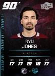
Ryu Jones || LW/C || Japan/World || 2183 Peak TPE Name: Ryu Jones Age: 20 Birthplace: Kobe, Japan Height: 6'1" Weight: 195 lbs Number: 27
Jonnyhockey17
Posts: 164
Threads: 5 Joined: Feb 2025
Reputation:
2
Discord: xxggboyzxx
Pronouns: Undisclosed
Player:
Jonny Hockey
Although they are all great, and unique in their own way, I’ll have to go with the Nashville Sound. Their colours, along with their sick logo and alternate jerseys make them the most appealing expansion branding to me!
Jonny Hockey - Goalie (#30) - Anchorage Armada [img]
MattyIce
Posts: 542
Threads: 14 Joined: Sep 2020
Reputation:
9
Discord: MattyIce#6353
Pronouns: Male
Player:
Easton Schaffer
I only saw like two of the new logos and tbh I was kinda surprised I couldn't easily find a post announcing all four teams and their branding. That' strange to me. I do like the Cincinnati one. I know there's a Madison one but it's ok
1140 TPE
OTT (S76-S80) BUF (S81-)
credit: enigmatic
389 TPE
COL (S56-60)
I quite like the whole vibe of the Nashville Sound. I love the colors, the name is awesome and has potential for fun promotional stuff. And it's cool to finally see a team in Nashville.
JuOSu
I mean all of them are really amazing to be honest, it was really hard to choose what I would like most! They did a great job!
Sizz
Posts: 539
Threads: 7 Joined: Mar 2023
Reputation:
13
Discord: _sizzle
Pronouns: He/Him
Player:
Max Carnage
I like that Madison tried to use the old Anaheim Ducks color scheme but I don't think it works with the rest of the branding. I like the Sound and Six probably the best in terms of the complete package although I do like the idea behind the Denver theme but am struggling to appreciate the color scheme. It reminds me a bit too much of the old Tampa Buccaneers logo but with powder blue mixed in for good measure.
81 words
Rookyi
Posts: 289
Threads: 7 Joined: Dec 2024
Reputation:
5
Discord: swf_recon
Pronouns: He/Him
Player:
Jordan Lafrenière
In my opinion the Nashville logo and sweater looks awesome tbf! The gms did a good job with the branding and yeah, hopefully they will be successful on the ice too!(not against BAP tho hahahaha)
[img=0x0]https://mail.google.com/mail/u/0?ui=2&ik=2f0e6ed611&attid=0.1.3&permmsgid=msg-f:1826331057310931490&th=19586e6b99481a22&view=fimg&fur=ip&permmsgid=msg-f:1826331057310931490&sz=s0-l75-ft&attbid=ANGjdJ-rBUyHICQFIWAWPhzF1wU7-hJ8fDG3UZpQYd-oj2oIFEjXNOF9tg5zax-yy9hOSYIRvrl7r3EVmRizK9pSJ4pJylGinHnnePr19QOafRwosYEeMTbQ0jUjZqA&disp=emb&zw[/img]Jordan Lafrenière || C || Kelowna/Baltimore || TPE Peak:TBD Name: Jordan Lafrenière Age: 19 Birthplace: Montréal, Québec Height: 6'2" Weight: 192 lbs Number: 14 --------------------------------------------------------------------- Draft results: -S80 SMJHL Draft: 17th Overall by Kelowna Knights -S81 SHL Draft: 4th Overall by Baltimore Platoon --------------------------------------------------------------------- Career stats: SMJHL | S80 | 66 GP | 13 G | 39 A | 52 PTS | +11 | 3 PPP | 38 PIM | 79 H | | S81 | 66 GP | 29 G | 50 A | 79 PTS | +28 | 12 PPP | 32 PIM | 77 H | --------------------------------------------------------------------- | SMJHL TOTALS | | 112 GP | 41 G | 89 A | 132 PTS | + 39 | 15 PPP | 70 PIM | 156 H |
As a Wisconsinite, it's gotta be Madison! It's always nice when Wisconsin gets some love, and Madison is a great city that I visit often, so I'm thrilled with the choice.
TheOPSquid
Posts: 1,182
Threads: 74 Joined: Sep 2023
Reputation:
35
Discord: theopsquid
Pronouns: He/Him
Player:
Squidwardo Tentaclés
I like all 4 of the brandings, the Denver branding is clean and I love the colour scheme, Madison's colours are amazing and the new logo is fire, Nashville is a classic hockey vibe, and Cincy's jerseys are top tier.
Squidwardo Tentacles | Seattle Argonauts | Captain | 2006 TPE
Birthplace: Riga, Latvia
Position: Left Wing
Number: 81 ]
Current Team: Seattle Argonauts
----------------------------------------------- SHL Career:
Seattle Argonauts: Regular Season | 264 GP | 77 G | 167 A | 244 P | -84 | 149 PIM | 426 H Playoffs | 9 GP | 3 G | 3 A | 6 P | -8 | 10 PIM | 14 H
-----------------------------------------------
SMJHL Career:
Yukon Malamutes:
Regular Season | 264 GP | 77 G | 167 A | 247 P | +34 | 212 PIM | 664 H
Playoffs | 36 GP | 10 G | 18 A | 28 P | -9 | 12 PIM | 91 H
-----------------------------------------------
Career Highlights:
S79 Silver Medal IIHF
S74 Bronze Medal WJC
S74 SMJHL All-Star
S76 SMJHL All-Star
5th All Time in Points for Yukon
5th All Time in Assists for Yukon
1st All Time in Penalty Minutes for Yukon
3rd All Time in Hits for Yukon
-----------------------------------------------
Team Awards:
S73-S76 Dynamite Award - Led Team in Hits
S74+76 Swing Dog Award - Led Team in Assists
S75+76 Prospector Award - Led Team in PIMs S76 Team Dog Award - Most Outstanding Forward
S76 Gold Rush Award - Led Team in Points
-----------------------------------------------
Transactions:
SMJHL Draft - 22nd OVR to Yukon
SHL Draft - 7th OVR to Seattle
aleks
I don't know if i really like any of them. If I had to pick one it would probably be the Valkyries as I feel that that logo is about as good as it can get within its concept. I also like the color scheme as every other team uses a red white blue of some variation and they are the only different team.
Aleksandr Iskandrov || C || Hamilton Steelhawks || Vancouver Whalers || 806 TPE ---------------------------------------------------------------------------------------------- SMJHL Career Stats S64: GP: 66 G: 6 A: 17 P: 23 S65: GP: 66 G: 11 A: 35 P: 46 S66: GP: 66 G: 37 A: 51 P: 88 S67: GP: 66 G: 35 A: 52 P: 87 TOTAL: GP: 264 G: 89 A: 155 P: 244 ---------------------------------------------------------------------------------------------- SMJHL Playoff Stats S64: GP: 12 G: 2 A: 4 P: 6 S65: GP: 4 G: 0 A: 2 P: 2 S66: GP: 11 G: 3 A: 8 P: 11 S67: GP: 5 G: 3 A: 2 P: 5 TOTAL: GP: 32 G: 8 A: 16 P: 24 ---------------------------------------------------------------------------------------------- SMJHL Achievements S67 Wollker Division Champion S66 Jared Hanson Trophy (Regular Season Points Leader) S66 Raymond Lindsay Trophy - Award Given to the Most Outstanding Player as Voted by the Players S66 Ideen Fallah Trophy - Award Given to the Most Outstanding Player as Voted by the Awards Committee S66 All Star Team S67 All Star Team ---------------------------------------------------------------------------------------------- WJC stats S64 ICE: GP: 12 G: 3 A: 4 P: 7 S65 RCL: GP: 12 G: 1 A: 3 P: 4 S66 RCL: GP: 12 G: 6 A: 3 P: 9 ---------------------------------------------------------------------------------------------- IIHF stats S67 RUS: GP: 12 G: 1 A: 0 P: 1 S68 JPN: GP: 12 G: 2 A: 1 P: 3 S69 JPN: GP: 12 G: 2 A: 3 P: 5 S70 JPN: GP: 12 G: 4 A: 1 P: 5 ---------------------------------------------------------------------------------------------- IIHF Playoff stats S67 RUS: GP: 3 G: 0 A: 0 P: 0 S69 JPN: GP: 1 G: 0 A: 1 P: 5 S70 JPN: GP: 3 G: 4 A: 1 P: 5 ---------------------------------------------------------------------------------------------- IIHF Achievements S70 JPN: Bronze Medal (General Manager and Player) ---------------------------------------------------------------------------------------------- SHL Statistics S68 HAM: GP: 66 G: 23 A: 30 P: 53 S69 HAM: GP: 66 G: 20 A: 30 P: 50 S70 HAM: GP: 66 G: 35 A: 46 P: 81 ---------------------------------------------------------------------------------------------- SHL Achievements Enlightened Centrist || C || Colorado Raptors ---------------------------------------------------------------------------------------------- SMJHL Career Stats S79: GP: 0 G: 0 A: 0 P: 0
Easily the Madison Valkyries now that they have been revamped. The colours, the logo, and the Scandinavian connection I feel in general. Everything about the branding feels special for me.
Brooklyn Physt || LD/RD || Los Angeles Panthers Height: 5'11" || Weight: 162lbs Number: 7 Birthplace: New Orleans, US of A August Von Hecht || G || Tampa Bay Barracuda Height: 5'8" || Weight: 179lbs Number: 89 Birthplace: Frankfurt, Germany ------------------------------------------------------------ SMJHL Season Career Statistics S66: ANC GP: 62 W: 29 L: 25 OTL: 5 SO: 1 GAA: 3.30 SV%: .895% S67: ANC GP: 58 W: 29 L: 20 OTL: 7 SO: 3 GAA: 2.86 SV%: .902% S68: ANC GP: 56 W: 30 L: 21 OTL: 5 SO: 4 GAA: 3.02 SV%: .893% S69: ANC GP: 33 W: 14 L: 14 OTL: 1 SO: 4 GAA: 2.97 SV%: .884% TOT: ANC GP: 209 W: 102 L: 80 OTL: 18 SO: 12 GAA: 3.05 SV%: .895% ------------------------------------------------------------ SMJHL Playoff Career Statistics S66: ANC GP: 6 W: 2 L: 3 OTL: 1 SO: 0 GAA: 2.85 SV%: 0.906% S67: ANC GP: 5 W: 1 L: 2 OTL: 1 SO: 0 GAA: 4.36 SV%: .863% S68: ANC GP: 10 W: 5 L: 3 OTL: 2 SO: 0 GAA: 2.77 SV%: .884% S69: ANC GP: 8 W: 3. L: 3 OTL: 2 SO: 1 GAA: 3.79 SV%: .873% TOT: ANC GP: 29 W: 11 L: 11 OTL: 6 SO: 1 GAA: 3.33 SV%: .882% ------------------------------------------------------------ SMJHL Hardware S67 Cedric Robinson Trophy Nominee ------------------------------------------------------------ SHL Season Career Statistics S70: TBB GP: 57 W: 13 L: 39 OTL: 1 SO: 0 GAA: 4.87 SV%: .885% S71: TBB GP: 58 W: 17 L: 29 OTL: 6 SO: 1 GAA: 4.14 SV%: .900% TOT: TBB GP: 115 W: 30 L: 68 OTL: 7 SO: 1 GAA: 4..50 SV%: .893% ------------------------------------------------------------ SHL Playoff Career Statistics S70: TBB GP: 0 W:0 L: 0 OTL: 0 SO: 0 GAA: 0.00 SV%: .000% S71: TBB GP: 5 W:1 L: 4 OTL: 0 SO: 1 GAA: 4.41 SV%: .899% TOT: TBB GP: 5 W:1 L: 4 OTL: 0 SO: 1 GAA: 4.41 SV%: .899% ------------------------------------------------------------ SHL Hardware ------------------------------------------------------------ Ruslan "Sparkplug" Zaporozhets || LW || Toronto/Calgary Height: 6'1" || Weight: 200lbs Number: 18 Birthplace: Zaporizhzhya, Ukraine ------------------------------------------------------------ SMJHL Season Career Statistics S50: STL GP: 50 G: 15 A: 12 PTS: 27 +/-: -9 PIM: 20 SH: 114 SH%: 13.16% Hits: 33 SB: 8 Fighting: 0-0-0 S51: STL GP: 50 G: 19 A: 21 PTS: 40 +/-: +1 PIM: 21 SH: 122 SH%: 15.57% Hits: 50 SB: 6 Fighting: 0-0-1 S52: STL GP: 50 G: 16 A: 30 PTS: 46 +/-: +11 PIM: 12 SH: 149 SH%: 10.47% Hits: 71 SB: 9 Fighting: 0-0-0 S53: STL GP: 50 G: 17 A: 25 PTS: 42 +/-: -10 PIM: 20 SH: 161 SH%: 10.56% Hits: 47 SB: 34 Fighting: 0-0-0 Tot: STL GP: 200 G: 67 A: 88 PTS: 155 +/-: -7 PIM: 73 SH: 546 SH%: 8.15% Hits: 201 SB: 57 Fighting: 0-0-1 ------------------------------------------------------------ SMJHL Playoff Career Statistics S50: STL GP: 13 G: 4 A: 3 PTS: 7 +/-: -1 PIM: 0 SH: 24 SH%: 16.67% Hits: 11 SB: 1 Fighting: 0-0-0 S51: STL GP: 12 G: 4 A: 6 PTS: 10 +/-: 7 PIM: 6 SH: 34 SH%: 11.76% Hits: 14 SB: 2 Fighting: 0-0-0 S52: STL GP: 17 G: 3 A: 5 PTS: 8 +/-: -3 PIM: 6 SH: 56 SH%: 5.36% Hits: 16 SB: 6 Fighting: 0-0-0 S53: STL GP: 14 G: 5 A: 3 PTS: 8 +/-: 0 PIM: 2 SH: 47 SH%: 10.64% Hits: 19 SB: 5 Fighting: 0-0-0 Tot: STL GP: 42 G: 16 A: 17 PTS: 33 +/-: 3 PIM: 14 SH: 161 SH%: 10.06% Hits: 60 SB: 14 Fighting: 0-0-0 ------------------------------------------------------------ SHL Season Career Statistics S54: TOR GP: 50 G: 16 A: 22 PTS: 38 +/-: -20 PIM: 28 SH: 109 SH%: 14.68% Hits: 111 SB: 56 Fighting: 0-0 S55: TOR GP: 50 G: 6 A: 15 PTS: 21 +/-: -41 PIM: 41 SH: 102 SH%: 05.88% Hits: 136 SB: 58 Fighting: 0-1 S56: TOR GP: 50 G: 15 A: 21 PTS: 36 +/-: -20 PIM: 24 SH: 121 SH%: 12.40% Hits: 115 SB: 40 Fighting: 0-0 S57: TOR GP: 66 G: 17 A: 31 PTS: 48 +/-: 5 PIM: 35 SH: 212 SH%: 8.02% Hits: 126 SB: 36 Fighting: 2-1 S58: TOR GP: 66 G: 37 A: 34 PTS: 71 +/-: 33 PIM: 20 SH: 216 SH%: 17.13% Hits: 159 SB: 40 Fighting: 0-0 S59: TOR GP: 66 G: 24 A: 39 PTS: 63 +/-: 14 PIM: 44 SH: 194 SH%: 12.40% Hits: 152 SB: 33 Fighting: 0-2 S60: TOR GP: 66 G: 22 A: 30 PTS: 52 +/-: 20 PIM: 48 SH: 179 SH%: 12.30% Hits: 274 SB: 17 Fighting: 0-0 S61: TOR GP: 66 G: 20 A: 22 PTS: 42 +/-: 11 PIM: 12 SH: 172 SH%: 11.60% Hits: 148 SB: 22 Fighting: 0-0 S62: TOR GP: 66 G: 16 A: 25 PTS: 41 +/-: 3 PIM: 38 SH: 165 SH%: 9.7% Hits: 182 SB: 28 Fighting: 0-0 S63: CGY/TOR GP: 65 G: 18 A: 21 PTS: 39 +/-: 7 PIM: 65 SH: 145 SH%: 12.40% Hits: 210 SB: 14 Fighting: 1-0 S64: TOR GP: 66 G: 18 A: 26 PTS: 44 +/-: -14 PIM: 22 SH: 139 SH%: 12.90% Hits: 183 SB: 64 Fighting: 0-0 S65: TOR GP: 66 G: 11 A: 19 PTS: 30 +/-: -29 PIM: 8 SH: 139 SH%: 7.90% Hits: 106 SB: 45 Fighting: 0-0 S66: TOR GP: 66 G: 17 A: 30 PTS: 47 +/-: 6 PIM: 16 SH: 170 SH%: 10.00% Hits: 85 SB: 78 Fighting: 0-0 Tot: TOR/CGY GP: 809 G: 237 A: 335 PTS: 572 +/-: -25 PIM: 401 SH: 2063 SH%: 11.49% Hits: 1987 SB: 531 Fighting: 3-4 ------------------------------------------------------------ SHL Playoff Career Statistics S54: TOR Did not qualify S55: TOR Did not qualify S56: TOR Did not qualify S57: TOR Did not qualify S58: TOR GP: 19 G: 4 A: 7 PTS: 11 +/-: 5 PIM: 2 SH: 49 SH%: 8.16% Hits: 51 SB: 5 Fighting: 0-0-0 S59: TOR Did not qualify S60: TOR GP: 4 G: 1 A: 0 PTS: 1 +/-: -3 PIM: 0 SH: 3 SH%: 33.33% Hits: 12 SB: 0 Fighting: 0-0-0 S61: TOR GP: 5 G: 0 A: 3 PTS: 3 +/-: 3 PIM: 0 SH: 6 SH%: 0.00% Hits: 8 SB: 4 Fighting: 0-0-0 S62: TOR GP: 4 G: 0 A: 2 PTS: 2 +/-: -7 PIM: 0 SH: 7 SH%: 0.00% Hits: 12 SB: 1 Fighting: 0-0-0 S63: TOR GP: 5 G: 2 A: 1 PTS: 3 +/-: 1 PIM: 4 SH: 11 SH%: 18.2% Hits: 21 SB: 2 Fighting: 0-0-0 S64: TOR GP: 5 G: 2 A: 0 PTS: 2 +/-: -3 PIM: 0 SH: 8 SH%: 25.0% Hits: 10 SB: 6 Fighting: 0-0-0 S65: TOR GP: 6 G: 1 A: 5 PTS: 6 +/-: 4 PIM: 0 SH: 15 SH%: 6.07% Hits: 9 SB: 4 Fighting: 0-0 S66: TOR GP: 6 G: 1 A: 5 PTS: 6 +/-: 4 PIM: 0 SH: 15 SH%: 6.07% Hits: 9 SB: 4 Fighting: 0-0 Tot: TOR GP: 48 G: 10 A: 18 PTS: 28 +/-: E PIM: 6 SH: 99 SH%: 10.10% Hits: 123 SB: 22 Fighting: 0-0-0 ------------------------------------------------------------ SHL Hardware S54 Ryan Jesster Nominee ------------------------------------------------------------ SMJHL Hardware NOTHING ------------------------------------------------------------ IIHF Awards/Medals S53 Won Silver with Czechia S54 Won Bronze with Czechia ------------------------------------------------------------
Richard "Big Dick" Physt || RD/LD || Alumni of Kel/Tor/Nola || Retired/CoGM of Toronto Height: 6'1" || Weight: 202lbs || Number: 62 Birthplace: Regina, Saskatchewan, Canada ------------------------------------------------------------ SMJHL Season Career Statistics S38 Kel GP:50, G:0, A:8 P:8, +/-:-1, PIMS:27, H:48, SB:32 fight rec: 0-0-1 S39 Kel GP:50, G:2, A:22, P:24, +/-10, PIMS:57, H:81, SB:39, fight rec: 0-0-1 S40 Kel GP:50, G:2, A:16, P:18, +/-14, PIMS:65, H:76, SB:48, fight rec: 0-0-5 SMJHL Season Career Totals: Teams: Kel GP:150, G:4, A:46, P:50, +/-:23, PIMS:149, H:205, SB:119, fight rec: 0-0-7 ------------------------------------------------------------ SMJHL Playoff Career Statistics S38 Kel GP:6, G:0, A:1 P:1, +/-:-0, PIMS:2, H:8, SB:7 fight rec: 0-0-0 S39 Kel GP:4, G:0, A:2, P:2, +/-0, PIMS:4, H:11, SB:1, fight rec: 0-0-0 S40 Kel GP:10, G:2, A:1, P:3, +/-3, PIMS:6, H:17, SB:14, fight rec: 0-0-0 SMJHL Playoff Career Totals: Teams: Kel GP:20, G:2, A:4, P:6, +/-:3, PIMS:12, H:36, SB:22, fight rec: 0-0-0 ------------------------------------------------------------ SHL Season Career Statistics S41 Tor GP:50, G:4, A:10, P:14, +/- -3, PIMS:120, H:83, SB:66, fight rec: 1-2-3 S42 Tor GP:50, G:2, A:14, P:16, +/- -9, PIMS:71, H:100, SB:82, fight rec: 1-0-2 S43 Tor GP:50, G:2, A:24, P:26, +/- 0, PIMS:44, H:109, SB:68, fight rec: 0-0-0 S44 Tor GP:50, G:6, A:10, P:16, +/- +10, PIMS:66, H:149, SB:76, fight rec: 1-0-1 S45 Tor GP:50, G:2, A:24, P:26, +/- +7, PIMS:44, H:123, SB:44, fight rec: 0-0-2 S46 Nola GP:50, G:4, A:28, P:32, +/- +27, PIMS:64, H:139, SB:54, fight rec: 1-0-1 S47 Nola GP:50, G:6, A:26, P:32, +/- +26, PIMS:67, H:119, SB:55, fight rec: 0-1-0 S48 Nola GP:50, G:6, A:29, P:35, +/- +14, PIMS:96, H:132, SB:62, fight rec: 1-1-1 S49 Nola GP:50, G:5, A:21, P:26, +/- -7, PIMS:59, H:101, SB:76, fight rec: 0-1-0 S50 Nola GP:50, G:4, A:29, P:33, +/- 14, PIMS:48, H:115, SB:74, fight rec: 0-0-0 SHL Season Totals: Teams: Tor/Nola GP:500, G:41, A:215, P:256, +/- +79, PIMS:679, H:1170, SB:657, fight rec: 5-5-10 ------------------------------------------------------------ SHL Playoff Career Statistics S41 Tor Did Not Qualify S42 Tor Did Not Qualify S43 Tor Did Not Qualify S44 Tor GP:7, G:2, A:2, P:4, +/- 0, PIMS:8, H:25, SB:14, fight rec: 0-0-0, Finish: Semi Finals S45 Tor GP:5, G:0, A:3, P:3, +/- 0, PIMS:6, H:16, SB:9, fight rec: 0-0-0, Finish: Semi Finals S46 Nola GP:20, G:1, A:5, P:6, +/- -8, PIMS:32, H:55, SB:25, fight rec: 0-0-2, Finish: Cup Finals S47 Nola GP:7, G:0, A:3, P:3, +/- 0, PIMS:15, H:20, SB:5, fight rec: 0-1-0, Finish: Semi Finals S48 Nola GP:13, G:2, A:2, P:4, +/- 0, PIMS:30, H:29, SB:21, fight rec: 1-1-0, Finish: Conference Finals S49 Nola GP:11, G:1, A:4, P:5, +/- -1, PIMS:8, H:19, SB:17, fight rec: 0-0-0, Finish: Conference Finals SHL Playoff Totals: Teams: Tor/Nola GP:63, G:6, A:19, P:25, +/- -9, PIMS:99, H:164, SB:91, fight rec: 1-2-2 ------------------------------------------------------------ GM Season Statistics S61: Tor W: 33, L: 29, OTL: 4, Cups:0 S62: Tor W: 32, L: 29, OTL: 5, Cups:0 Total: Tor W: 65, L: 58, OTL: 9, Cups:0 ------------------------------------------------------------ SHL Hardware Turd Ferguson Trophy (S41) Mathias Chouinard Trophy (Western Conference Champions) (S46) Bojo Biscuit Award (Best Defensive Defenseman) Nominee (S47) Bojo Biscuit Award (Best Defensive Defenseman) Nominee (S50) ------------------------------------------------------------ SMJHL Hardware 4 Star Cup (S40) ------------------------------------------------------------ IIHF Awards/Medals S43 Won Bronze with Austria S45 Won Bronze with Austria S47 Won Bronze with Austria ------------------------------------------------------------


 SilverBlitzenAG


![[Image: TROYMCCLURE.gif]](https://sig.grumpybumpers.com/host/TROYMCCLURE.gif)
![[Image: 5yBVV1C.jpeg]](https://i.imgur.com/5yBVV1C.jpeg)

![[Image: 9BV3NJC.png]](https://i.imgur.com/9BV3NJC.png)
![[Image: iZtWTrf.png]](https://i.imgur.com/iZtWTrf.png)
![[Image: R6eC8Fu.png]](https://i.imgur.com/R6eC8Fu.png)
![[Image: ApcZMh6.png]](https://i.imgur.com/ApcZMh6.png)
![[Image: Wednesy-Shrinetime.png?ex=67a21776&is=67...4a465a845&]](https://cdn.discordapp.com/attachments/1042983148209840228/1335966716550840330/Wednesy-Shrinetime.png?ex=67a21776&is=67a0c5f6&hm=9ae4425faa0b0feeda145683bdf4cffe7846b7ae96dd179711675844a465a845&)
![[Image: lq0SFPP.png]](https://i.imgur.com/lq0SFPP.png)
![[Image: CnPenxE.png]](https://i.imgur.com/CnPenxE.png)
![[Image: TheOPSquid.gif]](https://sig.grumpybumpers.com/host/TheOPSquid.gif)
![[Image: v2ZHYxx.png]](https://i.imgur.com/v2ZHYxx.png)
![[Image: rKRYSW6.png]](https://i.imgur.com/rKRYSW6.png)
![[Image: CptSquall.gif]](https://sig.grumpybumpers.com/host/CptSquall.gif)


![[Image: GCexCGNXwAAJQhM?format=jpg&name=small]](https://pbs.twimg.com/media/GCexCGNXwAAJQhM?format=jpg&name=small)
![[Image: JBourne3.gif]](https://sig.grumpybumpers.com/host/JBourne3.gif)
![[Image: aRCIyeu.png]](https://i.imgur.com/aRCIyeu.png)

![[Image: 0XJkcN5.png]](http://i.imgur.com/0XJkcN5.png)
 PROFILE
![[Image: luketd.gif]](https://sig.grumpybumpers.com/host/luketd.gif)
