Jearim
Posts: 1,213
Threads: 223 Joined: Jan 2018
Reputation:
23
Pronouns: Undisclosed
Player:
David Doughtty
12-30-2018, 03:33 PM
(This post was last modified: 12-30-2018, 04:56 PM by Jearim .)
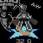
Back before S43 the Montreal Militia appointed a new GM in Barnabas Collins. He appointed Dean Atkins as his Co GM and they began to build the future of the Militia together. While that mostly involved roster movement in drafting players and trades, they also wanted to bridge the history of the Militia with it’s predecessor, the Montreal Impact. After a few seasons of trying and matching and mixing and creating, they finally agreed on a design that ties in two histories of the cities 2 SMJHL teams. Today, on the eve on the S45 Season, the Militia have called this press conference to reveal the new present of the team.
Starting off the press conference we would like to announce a new Logo for the Montreal Militia. In the spirit of the Impact and Militia we wanted to have a shield as a base to our logo. We also wanted to bring back the Blue and silver of the Impact. After some trial and error we decided to modify the original logo of the Impact slightly, as a result we are happy yo announce the we are happy with the New/Revamped logo for the Militia. So with out further ado, The New/ Revamped Montreal Militia.( I’ve been looking for who created the original Impact logo to credit them with the logo because all I did was add MONTREAL MILITIA and a second M to it. If you know who did or if your reading this, Reach out to me pls. )
LOGO,
SHOULDER PATCH
AND BANNER
THE JERSEYS STARTING S45
AWAY JERSEY
HOME JERSEY
ALTERNATE JERSEY
The concept behind the Alternate was to have the Red and Gold of the Current Militia Logo. Simple was the key word used here. It would have been easy to add a Skyline of Montreal or carry the Quebec flag over in the end the Red and Gold with a simple M fir Both Montreal and Militia was something we felt was simple and retro enough to fit perfectly for an alternate jersey used for special games. It’s a drastic difference from the home and away, but alternates should resemble nothing of the original home and away.
Amazing work by Jearim, made him change shit a zillion times I swear before we found what we liked. Couldn't be more proud of the job he did!
Dusty Rhodes || LW #24 || S67 || New Orleans Spectres|| 1344TPE Alias: The American Dream Born: 11/4/2004 Height: 6'3" Weight: 230 lbs Number: 24 Birth Place: Austin TX USA ------------------------------------------------------------ SMJHL Regular Season Statistics: ------------------------------------------------------------ Transactions: ------------------------------------------------------------ S66 Drafted 4th Rd 44th Ova by Anchorage Armada Awards: ------------------------------------------------------------ Kata Vilde || G #1 || S41 || Calgary Dragons || Retired Hall of Fame Alias: The Madness Born: 11/4/2000 Height: 6'3" Weight: 215 lbs Number: 1 Birth Place: Marstrand, Sweden ------------------------------------------------------------ SHL Regular Season Statistics: S44| CAL| GP 33| W: 17| L: 13| OTL: 3| SV%: .916| GAA: 2.61| SO: 1 S45| CAL| GP 41| W: 17| L: 22| OTL: 2| SV%: .904| GAA: 2.98| SO: 3 S46| CAL| GP 44| W: 22| L: 18| OTL: 4| SV%: .914| GAA: 2.84| SO: 2 S47| CAL| GP 44| W: 24| L: 14| OTL: 6| SV%: .912| GAA: 2.79| SO: 1 S48| CAL| GP 44| W: 21| L: 17| OTL: 6| SV%: .907| GAA: 2.95| SO: 0 S49| CAL| GP 44| W: 31| L: 10| OTL: 3| SV%: .916| GAA: 2.63| SO: 3 S50| CAL| GP 44| W: 23| L: 18| OTL: 3| SV%: .904| GAA: 2.98| SO: 2 S51| CAL| GP 44| W: 25| L: 17| OTL: 2| SV%: .915| GAA: 2.78| SO: 3 S52| CAL| GP 44| W: 20| L: 20| OTL: 4| SV%: .900| GAA: 3.18| SO: 0 S53| CAL| GP 44| W: 27| L: 14| OTL: 2| SV%: .901| GAA: 2.66| SO: 4 S54| CAL| GP 44| W: 21| L: 19| OTL: 4| SV%: .890| GAA: 3.32| SO: 2 S55| CAL| GP 44| W: 26| L: 13| OTL: 5| SV%: .915| GAA: 2.53| SO: 4 S56| CAL| GP 44| W: 34| L: 6| OTL: 4| SV%: .936| GAA: 1.65| SO: 9 S57| CAL| GP 48| W: 29| L: 17| OTL: 2| SV%: .908| GAA: 2.69| SO: 8 S58| CAL| GP 49| W: 29| L: 17| OTL: 3| SV%: .910| GAA: 2.54| SO: 4 S59| CAL| GP 43| W: 24| L: 15| OTL: 3| SV%: .918| GAA: 2.66| SO: 3 S60| CAL| GP 39| W: 23| L: 11| OTL: 4| SV%: .923| GAA: 2.37| SO: 4 ------------------------------------------------------------ SHL Playoff Statistics: S44| CAL| GP 4| W: 1| L: 3| OTL: 0| SV%: .893| GAA: 3.26| SO: 0 S46| CAL| GP 10| W: 6| L: 4| OTL: 0| SV%: .913| GAA: 2.38| SO: 1 S47| CAL| GP 15| W: 8| L: 4| OTL: 3| SV%: .906| GAA: 3.07| SO: 1 S48| CAL| GP 11| W: 6| L: 4| OTL: 1| SV%: .916| GAA: 2.68| SO: 1 S49| CAL| GP 7| W: 3| L: 4| OTL: 0| SV%: .898| GAA: 3.57| SO:2 S50| CAL| GP 20| W: 16| L: 4| OTL: 0| SV%: .920| GAA: 2.39| SO:1 S51| CAL| GP 7| W: 3| L: 3| OTL: 1| SV%: .905| GAA: 3.48| SO:0 S52| CAL| GP 13| W: 6| L: 5| OTL: 2| SV%: .913| GAA: 2.60| SO:1 S53| CAL| GP 7| W: 3| L: 3| OTL: 1| SV%: .914| GAA: 2.90| SO:0 S54| CAL| GP 5| W: 1| L: 3| OTL: 1| SV%: .912| GAA: 2.61| SO:0 S55| CAL| GP 6| W: 2| L: 4| OTL: 0| SV%: .910| GAA: 3.65| SO:0 S56| CAL| GP 6| W: 2| L: 4| OTL: 0| SV%: .894| GAA: 4.25| SO:0 S57| CAL| GP 6| W: 2| L: 4| OTL: 0| SV%: .899| GAA: 3.26| SO:0 S58| CAL| GP 5| W: 1| L: 2| OTL: 2| SV%: .908| GAA: 3.86| SO:1 S59| CAL| GP 6| W: 2| L: 4| OTL: 0| SV%: .923| GAA: 3.19| SO:0 S60| CAL| GP 7| W: 5| L: 2| OTL: 0| SV%: .910| GAA: 2.72| SO:0 ------------------------------------------------------------ SMJHL Regular Season Statistics: S40| KEL| GP 10| W: 03| L: 03| OTL: 0| SV%: .871| GAA: 2.94| SO: 0 S41| KEL| GP 46| W: 23| L: 13| OTL: 7| SV%: .876| GAA: 2.79| SO: 3 S42| KEL| GP 40| W: 29| L: 08| OTL: 2| SV%: .892| GAA: 2.50| SO: 0 S43| HAL| GP 45| W: 17| L: 19| OTL: 8| SV%: .869| GAA: 3.19| SO: 3 ------------------------------------------------------------ SMJHL Playoff Statistics: S41| KEL| GP 15| W: 12| L: 03| OTL: 0| SV%: .882| GAA: 2.64| SO: 0 S42| KEL| GP 10| W: 08| L: 01| OTL: 1| SV%: .915| GAA: 1.71| SO: 1 ------------------------------------------------------------ IIHF Round Robin Statistics: S44| SWE| GP 8| W: 2| L: 6| OTL: 0| SV%: .882| GAA: 4.13| SO: 0 S45| SWE| GP 10| W: 4| L: 5| OTL: 1| SV%: .912| GAA: 3.23| SO: 0 S46| SWE| GP 12| W: 7| L: 4| OTL: 1| SV%: .896| GAA: 3.33| SO: 0 S47| SWE| GP 2| W: 1| L: 1| OTL: 0| SV%: .892| GAA: 4.51| SO: 0 S48| SWE| GP 4| W: 1| L: 2| OTL: 1| SV% .848| GAA: 5.01| SO: 0: S49| SWE| GP 10| W: 6| L: 3| OTL: 0| SV% .926| GAA: 2.21| SO: 0: S50| SWE| GP 8| W: 2| L: 5| OTL: 1| SV% .905| GAA: 3.34| SO: 0: S51| SWE| GP 12| W: 6| L: 6| OTL: 0| SV% .906| GAA: 3.10| SO: 0: S52| SWE| GP 12| W: 8| L: 3| OTL: 0| SV% .927| GAA: 2.56| SO: 1: S53| SWE| GP 11| W: 6| L: 5| OTL: 0| SV% .923| GAA: 2.92| SO: 0: S54| SWE| GP 12| W: 7| L: 3| OTL: 2| SV% .916| GAA: 2.80| SO: 1: S55| SWE| GP 12| W: 7| L: 4| OTL: 1| SV% .910| GAA: 3.08| SO: 0: S56| SWE| GP 6| W: 4| L: 2| OTL: 0| SV% .899| GAA: 2.67| SO: 0: S57| SWE| GP 1| W: 0| L: 1| OTL: 0| SV% .788| GAA: 7.18| SO: 0: S58| SWE| GP 2| W: 1| L: 1| OTL: 0| SV% .872| GAA: 3.00| SO: 0: S59| LAT| GP 9| W: 2| L: 4| OTL: 2| SV% .913| GAA: 4.13| SO: 0: S60| LAT| GP 4| W: 0| L: 3| OTL: 0| SV% .902| GAA: 4.27| SO: 0: ------------------------------------------------------------ IIHF Medal Round Statistics: S46| SWE| GP 1| W: 0| L: 1| OTL: 0| SV%: .806| GAA: 7.12| SO: 0 S52| SWE| GP 3| W: 2| L: 1| OTL: 0| SV%: .933| GAA: 2.34| SO: 1 S53| SWE| GP 1| W: 0| L: 1| OTL: 0| SV%: .875| GAA: 5.00| SO: 0 S54| SWE| GP 1| W: 0| L: 1| OTL: 0| SV%: .907| GAA: 4.05| SO: 0 S55| SWE| GP 2| W: 1| L: 1| OTL: 0| SV%: .860| GAA: 5.31| SO: 0 ------------------------------------------------------------ Transactions: S40 Drafted 3rd Rd 24th Ova by Kelowna Knights S41 Drafted 1st Rd 14th Ova by Calgary Dragons S43 Traded from Kelowna Knights to Halifax Raiders for S43 Halifax 4th and S44 Halifax 2nd ------------------------------------------------------------ Awards: S40 SWE: WJC Cup S40 Kel: 4 Star Cup S41 Kel: 4 Star Cup S42 Kel: 4 Star Cup S42 Kel: SMJHL Top Goalie Nomination S42 Kel: SMJHL Playoff MVP Nomination S44 Cal: SHL All Rookie Team S44 Cal: SHL ROY Nomination S46 Cal: SHL McBride Nomination S46 Cal: 3rd Team All Star S47 Cal: SHL McBride Nomination S48 SWE: Gold Medal S49 SWE: IIHF best Goaltender S49 Cal: 2nd Team All Star S49 Cal: SHL McBride Nomination S50 Cal: Challenge Cup S50 Cal: Ratzov Trophy Nominee S51 Cal: SHL McBride Nomination S51 Cal: 2nd Team All Star S52 SWE: IIHF best Goaltender S53 SWE: IIHF best Goaltender S56 Cal: 1st Team All Star S56 Cal: McBride Nomination S56 Cal: Mike Honcho Award S60 Cal: 3rd Team All Star Vladimir Lidstrom || D #5 || S23 || Texas Renegades/Impact || Retired Texas Hall of Fame Alias: Vliddy Born: 11/4/1993 Height: 6'1" Weight: 190 lbs Number: 5 Birth Place: Krylbo, Sweden ------------------------------------------------------------ SHL Regular Season Statistics: S25| TEX| GP 50| G: 09| A: 23| P: 32|P/M : +14| PIM: 33| H: 66| SOG: 47 | SB: 68 S26| TEX| GP 50| G: 09| A: 21| P: 30|P/M : -04| PIM: 21| H: 66| SOG: 91 | SB: 81 S27| TEX| GP 50| G: 06| A: 24| P: 30|P/M : -02| PIM: 46| H: 47| SOG: 104 | SB: 75 S28| TEX| GP 50| G: 10| A: 25| P: 35|P/M : +10| PIM: 18| H: 54| SOG: 97 | SB: 59 S29| TEX| GP 50| G: 06| A: 25| P: 31|P/M : +08| PIM: 18| H: 55| SOG: 95 | SB: 67 S30| TEX| GP 50| G: 11| A: 45| P: 56|P/M : +00| PIM: 04| H: 21| SOG: 108 | SB: 74 S31| TEX| GP 50| G: 13| A: 37| P: 50|P/M : -10| PIM: 00| H: 05| SOG: 105 | SB: 78 S32| TEX| GP 50| G: 07| A: 38| P: 45|P/M : +03| PIM: 04| H: 23| SOG: 104 | SB: 67 S33| TEX| GP 50| G: 11| A: 26| P: 38|P/M : -20| PIM: 26| H: 81| SOG: 99 | SB: 73 S34| TEX| GP 50| G: 07| A: 35| P: 42|P/M : +04| PIM: 08| H: 04| SOG: 91 | SB: 81 S35| TEX| GP 50| G: 07| A: 19| P: 26|P/M : -03| PIM: 02| H: 04| SOG: 95 | SB: 55 S36| TEX| GP 50| G: 05| A: 12| P: 17|P/M : -08| PIM: 02| H: 05| SOG: 21 | SB: 38 S37| TEX| GP 50| G: 04| A: 11| P: 15|P/M : -07| PIM: 00| H: 08| SOG: 24 | SB: 42 S38| TEX| GP 50| G: 03| A: 25| P: 28|P/M : -04| PIM: 12| H: 46| SOG: 75 | SB: 73 S39| TEX| GP 50| G: 10| A: 25| P: 35|P/M : +17| PIM: 14| H: 62| SOG: 56 | SB: 73 S40| TEX| GP 50| G: 06| A: 22| P: 28|P/M : +01| PIM: 18| H: 39| SOG: 61 | SB: 79 ------------------------------------------------------------ Career| TEX| GP 800| G: 125| A: 413| P: 538|P/M : -01| PIM: 260| H: 586| SOG: 1273 | SB: 1083 ------------------------------------------------------------ SHL Playoff Statistics: S26| TEX| GP 07| G: 04| A: 03| P: 07|P/M : -01| PIM: 02| H: 14| SOG: 13 | SB: 11 S27| TEX| GP 06| G:02| A: 01| P: 03|P/M : +04| PIM: 07| H: 04| SOG: 10 | SB: 11 S28| TEX| GP 05| G: 00| A: 03| P: 03|P/M : -02| PIM: 00| H: 06| SOG: 10 | SB: 09 S29| TEX| GP 06| G: 02| A: 02| P: 04|P/M : +01| PIM: 02| H: 06| SOG: 11 | SB: 08 S30| TEX| GP 06| G:00| A: 05| P: 05|P/M : +02| PIM: 00| H: 02| SOG: 11 | SB: 11 S31| TEX| GP 06| G:00| A: 03| P: 03|P/M : +00| PIM: 00| H: 02| SOG: 11 | SB: 10 S34| TEX| GP 13| G: 02| A: 06| P: 08|P/M : +03| PIM: 00| H: 01| SOG: 28 | SB: 20 S35| TEX| GP 06| G: 00| A: 05| P: 05|P/M : +01| PIM: 00| H: 00| SOG: 06 | SB: 10 S36| TEX| GP 16| G: 02| A: 04| P: 06|P/M : +07| PIM: 00| H: 02| SOG: 11 | SB: 16 S37| TEX| GP 04| G: 00| A: 00| P: 00|P/M : +00| PIM: 00| H: 00| SOG: 01 | SB: 03 S40| TEX| GP 05| G: 00| A: 02| P: 02|P/M : -03| PIM: 00| H: 02| SOG: 04 | SB: 10 ------------------------------------------------------------ Career| TEX| GP77| G: 12| A: 34| P: 46|P/M : +12| PIM: 11| H: 39| SOG: 116 | SB: 119 ------------------------------------------------------------ SMJHL Regular Season Statistics: S22| MTL| GP 40| G:04| A: 19| P: 23|P/M : +04| PIM: 22| H: 42| SOG: 33 | SB: 45 S23| MTL| GP 40| G: 14| A: 23| P: 37|P/M : +03| PIM: 31| H: 43| SOG: 118 | SB: 27 S24| MTL| GP 52| G: 11| A: 29| P: 40|P/M : -02| PIM: 39| H: 32| SOG: 99 | SB: 60 ------------------------------------------------------------ Career| MTL| GP 132| G: 29| A: 71| P: 100|P/M : +05| PIM: 92| H: 117| SOG: 250 | SB: 132 ------------------------------------------------------------ SMJHL Playoff Statistics: S22| MTL| GP 09| G: 00| A: 02| P: 02|P/M : -07| PIM: 20| H: 15| SOG: 02 | SB: 11 S23| MTL| GP 07| G: 03| A: 00| P: 03|P/M : +02| PIM: 02| H: 12| SOG: 29 | SB: 03 S24| MTL| GP 17| G: 02| A: 15| P: 17|P/M : +01| PIM: 18| H: 11| SOG: 32 | SB: 14 ------------------------------------------------------------ Career| MTL| GP 33| G: 05| A: 17| P: 22|P/M : -04| PIM: 40| H: 38| SOG: 63 | SB: 28 ------------------------------------------------------------ IIHF Statistics: S24| SWE| GP 11| G: 00| A: 00| P: 00|P/M : -03| PIM: 00| H: 04| SOG: 05 | SB: 02 S25| SWE| GP 11| G: 00| A:01| P: 01|P/M : -04| PIM: 04| H: 03| SOG: 00 | SB: 09 S26| SWE| GP 12| G: 01| A: 04| P: 05|P/M : +03| PIM: 00| H: 00| SOG: 12 | SB: 16 S27| SWE| GP 13| G: 03| A: 07| P: 10|P/M : +04| PIM: 06| H: 04| SOG: 14 | SB: 14 S28| SWE| GP 13| G:02| A: 07| P: 09|P/M : +04| PIM: 04| H: 25| SOG: 22 | SB:17 S29| SWE| GP 13| G: 04| A: 05| P: 09|P/M : +00| PIM: 04| H: 21| SOG: 24 | SB: 21 S30| SWE| GP 10| G: 01| A: 08| P: 09|P/M : +03| PIM: 12| H: 11| SOG: 21 | SB: 12 S31| SWE| GP 12| G: 00| A: 08| P: 08|P/M : -01| PIM: 12| H: 03| SOG: 17 | SB: 12 S32| SWE| GP 11| G: 03| A: 02| P: 05|P/M : +01| PIM: 08| H: 06| SOG: 22 | SB: 06 S33| SWE| GP 10| G: 01| A: 03| P: 04|P/M : -08| PIM: 10| H: 24| SOG: 19 | SB: 23 S34| SWE| GP 12| G: 01| A: 07| P: 08|P/M : +04| PIM: 12| H: 14| SOG: 19 | SB: 16 S35| SWE| GP 13| G: 01| A: 06| P: 07|P/M : -03| PIM: 00| H: 04| SOG: 23 | SB: 12 S36| SWE| GP 10| G: 01| A: 05| P: 06|P/M : -04| PIM: 00| H: 01| SOG: 13 | SB: 14 S37| SWE| GP 11| G: 01| A: 07| P: 08|P/M : +02| PIM: 00| H: 02| SOG: 09 | SB: 08 S38| SWE| GP 10| G: 03| A: 02| P: 05|P/M : +02| PIM: 04| H: 00| SOG: 16 | SB: 12 S39| SWE| GP 11| G: 07| A: 00| P: 07|P/M : +02| PIM: 00| H: 06| SOG: 13 | SB: 11 S40| SWE| GP 10| G:00| A: 02| P: 02|P/M : -02| PIM: 02| H: 02| SOG: 08 | SB: 18 S41| SWE| GP 10| G:00| A: 05| P: 05|P/M : -01| PIM: 00| H: 01| SOG: 11 | SB: 13 ------------------------------------------------------------ Career| SWE| GP 203| G: 29| A: 79| P: 108|P/M : -01| PIM: 78| H: 131| SOG: 268 | SB: 236 ------------------------------------------------------------ Transactions: S22 Drafted 4th Rd 20th Ova by Montreal Impact S23 Drafted 1st Rd 9th Ova by Texas Renegades ------------------------------------------------------------ Awards: S23 Mtl: Christopher Klose Award S23 Mtl: Petr Klimek Award S23 Mtl: Armin Brovalchuk Award S23 Mtl: Kurtis Hunter Award S24 Mtl: Alternate Captain S24 Mtl: Darian Scherbluk Award S25 Tex: SHL All Rookie Team S26 Tex: Alternate Captain S27 Tex: Alternate Captain S28 Tex: Alternate Captain S27 Swe: Silver Medal S28 Swe: Gold Medal S29 Mtl: Elected to Montreal Hall of Fame S29 Tex: Alternate Captain S29 Swe: Gold Medal S30 Tex: Alternate Captain S30 Tex: Stevens Award Finalist S30 Tex: 2nd Team All Star S31 Tex: Alternate Captain S31 Tex: 2nd Team All Star S32 Tex: 2nd Team All Star S33 Tex: Captain S34 Tex: 3rd Team All Star S34 Tex: Captain S35 Swe: Silver Medal S36 Tex: Challenge Cup Winner S39 Tex: Alternate Captain S40 Tex: Alternate Captain
Well, if they aren't going to change the actual name, I'm glad the color scheme is back.
Good work, Montreal.
Alonzo Garbanzo Final Tallies (Among Defensemen):
2nd in Goals (208),
All-Time Assists Leader (765)*,
All-Time Points Leader (973), 3rd in Hits (2587),
All-Time Blocked Shots Leader (1882)*
*All-Time Leader Among All Skaters
Player Profile |
Update Thread Alonzo Garbanzo (Retired) | D | Minnesota Chiefs Age: 41 Height: 6'1" Weight: 185 lbs Number: 2 Player Type: TWD ------------------------------- SMJHL Regular Season Statistics (S20) MTL | GP: 40 | G: 8 | A: 21 | P: 29 | +/-: +13 | SB: 62 ------------------------------- SMJHL Playoff Statistics (S20) MTL | GP: 6 | G: 0 | A: 2 | P: 2 | +/-: -2 | SB: 9 ------------------------------- SHL Regular Season Statistics (S21-S43) MIN | GP: 1158 | G: 200 | A: 750 | P: 950 | +/-: Even | HIT: 2538 | SB: 1807 ------------------------------- SHL Playoff Statistics (S21-S41) MIN | GP: 139 | G: 20 | A: 89 | P: 109 | +/-: -19 | HIT: 291 | SB: 234 ------------------------------- IIHF Statistics (S21-S38) SWE | GP: 211 | G: 36 | A: 125 | P: 161 | +/-: +16 | HIT: 553 | SB: 325 ------------------------------- International Awards IIHF Gold Medal (S28, S29) IIHF Silver Medal (S21, S27, S35) IIHF Bronze Medal (S22, S23) ------------------------------- Transactions S20 | Drafted 3rd Overall to the Montreal Impact S21 | Drafted 2nd Overall to the Minnesota Chiefs ------------------------------- Notable Events S21 | Named Alternate Captain of the Minnesota Chiefs S23 | Named Captain of the Minnesota Chiefs S24 | 4th in Assists S24 | 4th in Defensemen Points S26 | 1st in Assists S26 | 1st in Defensemen Points S26 | 2nd in Penalty Minutes S27 | 1st in Defensemen Points S27 | T-1st in Defensemen Goals S27 | 1st in Blocked Shots S27 | 2nd in Game-Tying Goals S29 | 4th in Assists S29 | 5th in Defensemen Points S30 | 4th in Assists S30 | 4th in Defensemen Points S30 | T-3rd in Defensemen Goals S30 | 3rd in Blocked Shots S31 | 2nd in Assists S31 | 2nd in Defensemen Points S31 | 4th in Blocked Shots S32 | 2nd in Blocked Shots S33 | 1st in Blocked Shots S33 | 1st in Defenseman Points S33 | 3rd in Defenseman Goals S34 | 4th in Assists S34 | 2nd in Blocked Shots S34 | 4th in Defenseman Points S35 | 2nd in Defenseman Points S36 | 4th in Assists S36 | 5th in Blocked Shots S36 | T-1st in Defenseman Points S36 | T-4th in Defensemen Goals S37 | T-3rd in Assists S37 | T-3rd in Defensemen Goals S37 | 3rd in Defensemen Points S40 | 1st in Defenseman Points S40 | T-4th in Defensemen Goals S40 | 1st in Plus/Minus S41 | T-2nd in Power Play Goals ------------------------------- SHL All-Star Selections 9x SHL 1st Team (S26, S27, S30, S31, S33, S35, S36, S37, S40) 2x SHL 2nd Team (S24, S34) 2x SHL 3rd Team (S29, S32) ------------------------------- SHL Awards 5x Scott Stevens Trophy (S27, S31, S33, S37, S40) 1x Ron Mexico Trophy (S27) Aidan Richan Trophy (S24) 1x Challenge Cup (S39) 5x Scott Stevens Nominee (S24, S26, S30, S35, S36) 1x Ron Mexico Nominee (S31) 3x Damian Littleton Nominee (S26, S31, S40) 1x Challenge Cup Finalist (S40) Borromini Cannellini | C | Los Angeles Panthers Age: 16 Height: 6'-4" Weight: 210 lbs Number: 17 Player Type: SNP ------------------------------- SMJHL Regular Season Statistics (S45-S47) VAN | GP: 150 | G: 51 | A: 69 | P: 120 | +/-: +37 | HIT: 153 ------------------------------- SMJHL Playoff Statistics (S45-S47) VAN | GP: 27 | G: 11 | A: 10 | P: 21 | +/-: +5 | HIT: 24 ------------------------------- SHL Regular Season Statistics (S48-) ------------------------------- SHL Playoff Statistics (--) ------------------------------- IIHF Statistics (--) ------------------------------- International Awards ------------------------------- Transactions S45 | Drafted 7th Overall to the Vancouver Whalers S46 | Drafted 10th Overall to the Los Angeles Panthers
Hoovuh
Thats going to be a yikes from me dawg
Sean
crutch
CARTER CRUTCHFIELD || RD || ARMADA || 242 TPE NAME: Carter Crutchfield BIRTHPLACE: Los Angeles, California HEIGHT: 6'1" WEIGHT: 195 lbs NUMBER: 2 ------------------------------------------------------------ SMJHL CAREER STATS S65 ANC : GP: , G: , A: , P: , +/-: ------------------------------------------------------------ SMJHL PLAYOFF STATS S65 STL: GP: , G: , A: , P: , +/-: ------------------------------------------------------------ SHL CAREER STATS S6X ???: GP: , G: , A: , P: , +/-: ------------------------------------------------------------ SHL PLAYOFF STATS S6X ???: GP: , G: , A: , P: , +/-: ------------------------------------------------------------ TRANSACTIONS S65 - SMJHL - Drafted Pick 34, Round 3 by the Anchorage Armada ------------------------------------------------------------ CONTRACTS S65 - ANC: $3,000,000 ------------------------------------------------------------ AWARDS / TROPHY CASE ------------------------------------------------------------
Jearim
Posts: 1,213
Threads: 223 Joined: Jan 2018
Reputation:
23
Pronouns: Undisclosed
Player:
David Doughtty
12-30-2018, 04:25 PM Hoovuh Wrote:
That's why no one cares dawg lol
kit
12-30-2018, 04:46 PM
(This post was last modified: 12-30-2018, 04:46 PM by kit .)
just change the name back to impact if ur gonna change the logo back too imo
that being said: fuck the impact
Good_Ole_Kimmy
Posts: 1,824
Threads: 50 Joined: Jul 2018
Reputation:
62
Discord: GoodOleKimmy#9161
Pronouns: He/Him
Player:
Jolmi Koivu
Wow this is not the move
(Sig Credit: toedragon84)
Jolmi Koivu || RW/C || Colorado Raptors || 289TPE
------------------------------------------------------------
SMJHL Regular Season Stats
S55 - COL || 66GP || 12G ||23A || 35P || +/-: 9 || 129 SOG
------------------------------------------------------------
Player History
Drafted Round 3 pick 36 to Colorado Raptors
Andrew Martin || C || Hamilton Steelhawks || 722TPE
------------------------------------------------------------
SMJHL Regular Season Stats
S42 - COL || 50GP || 8G || 8A || 16P || +/-: -1 || 44 SOG
S43 - COL/VAN || 50GP || 16G || 32A || 48P || +/-: 15 || 124 SOG
S44 - VAN || 50GP || 16G || 33A || 49P || +/-: 8 || 113 SOG
------------------------------------------------------------
SMJHL Playoff Stats
S42 - COL || 4GP || 0G || 2A || 2P || +/-: 0 || 5 SOG
S43 - VAN || 10GP || 7G || 4A|| 11P || +/-: 4 || 23 SOG
S44 || 14GP || 6G || 7A || 13P || +/-: 0 || 33SOG
------------------------------------------------------------
IIHF Stats
S43 - GER || 12GP || 0G || 0A || 0P || +/-: -3 || 5SOG
S44 - GER || 1GP || 0G || 0A || 0P || +/-: 0 || 0SOG
------------------------------------------------------------
SHL Regular Season Stats
S44 - HAM || 50GP || 12G || 13A || 25P || +/-: -13 || 95SOG
------------------------------------------------------------
Player History
S42:
Drafted 46th Overall by Colorado Raptors
Named Alternate Captain of the Colorado Raptors
Signed 1 year 3 million dollar deal with Raptors
S43:
Drafted 17th Overall by Hamilton Steelhawks
Signed 1 year 3 million dollar deal with the Steelhawks
Traded to Vancouver Whalers from Colorado Raptors
Won the S43 Four Star Cup with the Vancouver Whalers
S44:
Signed 1 year 2 million dollar deal with the Steelhawks
What a lazy rebrand. Not to mention those abortions of an alternate jersey
Sven Holmberg
Player Page |
Update Page
Mattias Holmberg | D | Retired Name: Mattias Holmberg Position: Defense Player Type: Two-Way Defenseman Shoots: Right Height: 6'1" Weight: 198 lbs Number: 16 Birthplace: Karlstad, Sweden ------------------------------------------------------------ Career Statistics: ------------------------------------------------------------ SMJHL Career Statistics: ------------------------------------------------------------ S25 | MTL | GP: 26 | G: 3 | A: 9 | PTS: 12 | +/-: -1 | PIM: 4 | Hits: 11 | S. Blocked: 20 S25 | DET | GP: 4 | G: 2 | A: 0 | PTS: 2 | +/-: -1 | PIM: 2 | Hits: 3 | S. Blocked: 1 S26 | MTL | GP: 50 | G: 10 | A: 21 | PTS: 31 | +/-: 2 | PIM: 22 | Hits: 38 | S. Blocked: 42 S27 | MTL | GP: 50 | G: 9 | A: 31 | PTS: 40 | +/-: 15 | PIM: 0 | Hits: 10 | S. Blocked: 48 ------------------------------------------------------------ SMJHL Playoffs: ------------------------------------------------------------ S25 | DET | GP: 5 | G: 2 | A: 3 | PTS: 5 | +/-: -4 | PIM: 4 | Hits: 3 | S. Blocked: 7 S26 | MTL | GP: 5 | G: 2 | A: 1 | PTS: 3 | +/-: -2 | PIM: 2 | Hits: 7 | S. Blocked: 4 S27 | MTL | GP: 17 | G: 4 | A: 8 | PTS: 12 | +/-: 8 | PIM: 8 | Hits: 20 | S. Blocked: 19 ------------------------------------------------------------ SHL Career Statistics ------------------------------------------------------------ S28 | LAP | GP: 50 | G: 3 | A: 6 | PTS: 9 | +/-: -3 | PIM: 44 | Hits: 86 | S. Blocked: 58 S29 | LAP | GP: 38 | G: 3 | A: 9 | PTS: 12 | +/-: -11 | PIM: 22 | Hits: 43 | S. Blocked: 50 S29 | POR | GP: 12 | G: 2 | A: 9 | PTS: 11 | +/-: -8 | PIM: 0 | Hits: 2 | S. Blocked: 22 S30 | POR | GP: 50 | G: 11 | A: 21 | PTS: 32 | +/-: -19 | PIM: 18 | Hits: 27 | S. Blocked: 108 S31 | POR | GP: 50 | G: 13 | A: 30 | PTS: 43 | +/-: -7 | PIM: 36 | Hits: 50 | S. Blocked: 128 S32 | NEW | GP: 50 | G: 8 | A: 15 | PTS: 23 | +/-: 10 | PIM: 0 | Hits: 7 | S. Blocked: 58 S33 | NEW | GP: 50 | G: 0 | A: 22 | PTS: 22 | +/-: 18 | PIM: 4 | Hits: 7 | S. Blocked: 63 S34 | SEA | GP: 50 | G: 13 | A: 21 | PTS: 34 | +/-: 0 | PIM: 0 | Hits: 2 | S. Blocked: 67 S35 | SEA | GP: 50 | G: 7 | A: 26 | PTS: 33 | +/-: -13 | PIM: 0 | Hits: 4 | S. Blocked: 91 S36 | WKP | GP: 50 | G: 8 | A: 14 | PTS: 22 | +/-: -10 | PIM: 16 | Hits: 32 | S. Blocked: 67 S37 | WKP | GP: 50 | G: 7 | A: 12 | PTS: 19 | +/-: 16 | PIM: 24 | Hits: 34 | S. Blocked: 57 ------------------------------------------------------------ SHL Playoff Career Statistics ------------------------------------------------------------ S32 | NEW | GP: 11 | G: 2 | A: 4 | PTS: 6 | +/- 3 | PIM: 2 | Hits: 2 | S. Blocked: 20 S33 | NEW | GP: 18 | G: 1 | A: 5 | PTS: 6 | +/- 3 | PIM: 2 | Hits: 5 | S. Blocked: 19 S37 | WKP | GP: 12 | G: 0 | A: 1 | PTS: 1 | +/- -2 | PIM: 2 | Hits: 5 | S. Blocked: 15 ------------------------------------------------------------ Awards: (S27) Named Alternate Captain for Montreal Impact (S27) (S27) Awarded Ron Bolt Trophy in SMJHL for Most Sportsmanlike Player (S31) Named to Third Team All-Stars (S33) Challenge Cup Champion with New England Wolfpack ------------------------------------------------------------ Transactions: (S25) Signed SMJHL $1.5 Million/1 year contract with Montreal Impact(Free Agent) (S25) Traded to Detroit Falcons (S26) Drafted 2nd Round, 24 overall in S26 SHL draft by Los Angeles Panthers (S26) Traded to Montreal Impact with Sven Karlsson (S26) Signed 2 year, $5 Million contract with Los Angeles Panthers (S27) Signed 4 year, $11 Million contract extension with Los Angeles Panthers (S29) Traded from Los Angeles Panthers to the Portland Admirals (S31) Traded from Portland Admirals to New England Wolfpack (S31) Signed 1 year, $3 Million contract with New England Wolfpack for S32 (S32) Signed 1 year, $5 Million contract with New England Wolfpack for S33 (S33) Signed 2 year, $16 million player option contract with New England Wolfpack (S33) Traded from New England Wolfpack to Seattle Riot (S35) Traded from Seattle Riot to West Kendall Platoon (S36) Signed 2 year, $11 million player option contract with West Kendall Platoon (S38) Signed 2 year, $9 million player option contract with Los Angeles Panthers (S38) Traded from Los Angeles Panthers to the Manhattan Rage (S39) Traded from the Manhattan Rage to the Minnesota Chiefs ------------------------------------------------------------ Teams Holmberg Played For: Detroit Falcons, Montreal Impact, Portland Admirals, New England Wolfpack, Seattle Riot, West Kendall Platoon, Los Angeles Panthers, Manhattan Rage, Minnesota Chiefs, Edmonton Blizzard, Hamilton Steelhawks Sulak O'Hritea | F | Retired Justin Keahi| F | Chicago Mob-y Boi Was a Chicago Mob-y Boi Now a Tampa Bay Fishy Boi Philadelphia Forgey Boi until they were meanies >:( Short time as a New England Wolfie Boi Chicago Mob-y Boi but I actually play for them this time
O4L
glad the colors are back but still miss the brand
Durden
12-30-2018, 04:06 PM ArGarBarGar Wrote:
Ditto.
Update Page |
|
|
Player Page
Jack Durden:
Season 24 - *4 Star Cup Champions - Vancouver Whalers*
Season 36 - *Challenge Cup Champions - Texas Renegades*
Season 36 - *Anton Razov Trophy Winner - Playoff MVP - Texas Renegades*
Season 41 - *IIHF Gold Medalist - Team United Kingdom*
Season 41 - *Triple Gold Member*
**Vancouver Whalers Hall of Fame**
**Texas Renegades Hall of Fame**
**Hall of Fame Member**
Loganjj21
Posts: 534
Threads: 59 Joined: Jul 2017
Reputation:
9
Discord: Loganjj21#3013
Pronouns: Male
Just steal a soccer clubs Logo, Colors, and jersey scheme how original , I bet this was real hard work when u stole everything
Wasty
sash


 Jearim
![[Image: 3qeWDjK.jpg]](https://i.imgur.com/3qeWDjK.jpg)
![[Image: vcU4f6i.png]](https://i.imgur.com/vcU4f6i.png)
![[Image: TbTIGWi.jpg]](https://i.imgur.com/TbTIGWi.jpg)
![[Image: 4S5I1pb.jpg]](https://i.imgur.com/4S5I1pb.jpg)
![[Image: 85HNPct.jpg]](https://i.imgur.com/85HNPct.jpg)
![[Image: 8RdYbOt.jpg]](https://i.imgur.com/8RdYbOt.jpg)
![[Image: re9MjR0.jpg]](https://i.imgur.com/re9MjR0.jpg)
![[Image: 54855_s.gif]](https://signavatar.com/54855_s.gif)
 ||
|| 
 ||
||  ||
|| 
 ||
||
![[Image: jearim.gif]](https://sig.grumpybumpers.com/host/jearim.gif)
![[Image: iUd7IJE.png]](https://i.imgur.com/iUd7IJE.png)
![[Image: rhodes.png]](https://cdn.discordapp.com/attachments/694020619620188191/997234193056665711/rhodes.png)
![[Image: IeEV7Iv.png]](https://i.imgur.com/IeEV7Iv.png)
![[Image: 57879_s.gif]](https://signavatar.com/57879_s.gif)
![[Image: 37742_s.gif]](https://signavatar.com/37742_s.gif)
![[Image: jov7Yk9.png]](https://i.imgur.com/jov7Yk9.png)
 | Player Page
 ![[Image: NiclasWastlund26.gif]](https://sig.grumpybumpers.com/host/NiclasWastlund26.gif)

![[Image: vlPUU9v.png]](https://i.imgur.com/vlPUU9v.png)
![[Image: ammBPLt.png]](https://i.imgur.com/ammBPLt.png)
![[Image: rnZeas5.png]](https://i.imgur.com/rnZeas5.png)
![[Image: V9MXpXR.png]](https://i.imgur.com/V9MXpXR.png)


![[Image: ZLoVQGU.png]](https://i.imgur.com/ZLoVQGU.png)
![[Image: M02LOrx.png]](https://i.imgur.com/M02LOrx.png)
![[Image: TommySalami.gif]](https://sig.grumpybumpers.com/host/TommySalami.gif)


![[Image: g7VtVXX.png?1]](https://i.imgur.com/g7VtVXX.png?1)
![[Image: Z8YSDad.gif]](https://i.imgur.com/Z8YSDad.gif)
![[Image: crutchfield.gif]](http://sig.grumpybumpers.com/host/crutchfield.gif)

![[Image: 34964_s.gif]](https://signavatar.com/34964_s.gif)
![[Image: thd650h.png]](https://i.imgur.com/thd650h.png)


![[Image: cooldudeam1234.gif]](https://sig.grumpybumpers.com/host/cooldudeam1234.gif)

![[Image: hexx55.gif]](http://sig.grumpybumpers.com/host/hexx55.gif)
![[Image: mitochondriafigure1.jpg]](https://micro.magnet.fsu.edu/cells/mitochondria/images/mitochondriafigure1.jpg)

![[Image: sharnaz.png]](https://media.discordapp.net/attachments/831282703767830599/959659352124448778/sharnaz.png)
